
I’m Lalig, I create effective and delightful experiences.
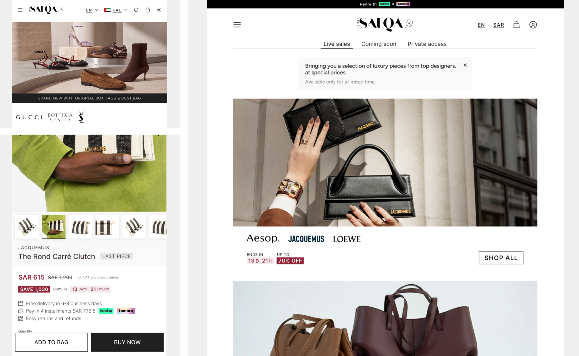

Redesigning a luxury flash-sale platform
Maison Safqa is a luxury flash-sale platform offering time-limited private sales on premium fashion, beauty, and lifestyle brands across Saudi Arabia and the UAE. The brand needed a digital home that matched the names it carries: an exclusive, fresh and modern experience that keeps the classy, high-end feel. I redesigned the full platform across web and mobile, and built a new design system and visual language from the ground up.
Problems to solve
- Outdated look and feel: The previous site felt dated and didn't reflect the premium brands on sale, like Bottega Veneta and Gucci.
- A "discount" aesthetic: Sale events borrowed the loud, advertising-style cues of outlet stores, like red and yellow banners, making exclusive private sales feel like a mass clearance.
- Inconsistent imagery: Every sale event used its own mix of campaign photos, logos and banners, so the homepage felt random and out of place with the platform.
- Hard to navigate: The menu mixed shopping, account and partner links in one long list, making it difficult to find the right sale or product.
The Approach
The goal was to make every sale feel like "a private invitation, not a clearance." I focused on a clean, editorial layout that lets the brands and their products take center stage, supported by a rigorous design system.
Bespoke Design System
I built a complete design system covering color, typography, layout and visual style, along with custom icons and over 30 components. Every new sale, page and flow is now built from the same consistent pieces, across web and mobile.
Elegant Sale Events
Sales are traditionally red, yellow and loud. Instead, I designed sale events with a restrained palette, refined typography and quiet countdown and discount details, so even a 70% off event feels high-end and professional.
An Imagery Guide for Every Sale
I created a guide for choosing imagery for each sale event ahead of launch. Instead of random visuals that never worked together, every sale now sits alongside the others as one curated edit, true to the platform's aesthetic.
Effortless Navigation
I restructured the navigation and interactions around how people actually shop for sales. Testing showed the new structure is easier to use, avoids confusion and reduces drop-offs.
Results
- 19% increase in conversion
- 41% lower bounce rate
- 12% longer sessions
- Client feedback: The Maison Safqa team was thrilled with the new look and feel, a platform that finally looks as premium as the brands it sells.